Example Results
On this page, you can see a possible output of the application. Three interactive maps are created of the classified vegetation, and the change between the years. On the upper right part, the different basemaps and the classification results can be selected.
For more information on interactive maps, see the tutorial on interactive mapping.
Classified Vegetation Map
The following interactive map is the result of running the vegetation classification part of the script. If only one areal photo is used, only one vegetation classification will be returned in this interface. This particular example shows the classification result for a calculation with and one without additional LiDAR data. When you compare the two maps, it is easy to see that especially trees and shrubs are often confused when only spectral imagery is used.
The vegetation stability shows in which areas the changes takes place (red) and where both calculation have the same result (green). This map is added to the interface to assist the comparing of the two vegetation classification results.
For more information on how these maps are created, see the training dataset tutorial, the LiDAR preprocessing tutorial, and the the classifying vegetation tutorial.
Overall Vegetation Change Between two years
From the previous results, the script calculates the change between the two years by comparing each pixel. The output is the interactive map as shown below. A lot of classes are shown, since each possible combination between two classes should be potentially available.
For more information, see the tutorial on vegetation succession.
Vegetation Change Between two years per Class
If the user is interested in the change of a particular vegetation class, the following map is useful. It shows the change in each class, one at the time as the user chooses the class they are interested in at the top right of the interactive interface. It shows which parts of that class are stable, and which change. The latter shows both the change from another class into this class, as the change from this class into another class.
For more information, see the tutorial on seperate vegetation change maps.
Statistics and Validation
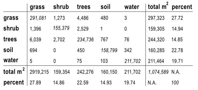
In order to be able to get a clear insight in the surface area of the vegetation classes that have changed, the numbers of each class for both years will also be returned by the script. The following matrix is roughly what this will look like. The x-axis shows the class the number of pixels belonged to in year one, and the y-axis shows year two.
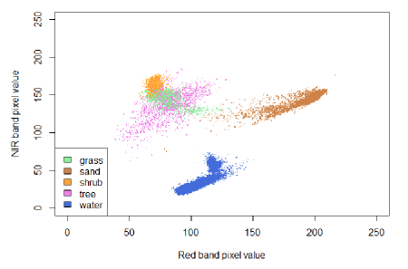
If the user would like to see how well the classification was made, then the following image is also made. This scatter plot shows the spectral values of the training data in the NIR and the red band. If all the values of a single class are grouped close together, but far from the other classes, that means that they are easy to identify based on these two bands and will thus be best classified. See the water class in the image below. Since the different vegetation classes all have similar characteristics, it is to be expected that they overlap more. Therefore, the error will be slightly larger. However, in the example below, the groups do cluster quite well.
Another possibility to assess the accuracy of the result is looking at the confusion matrix. For this, the result of the classification is compared to the known training polygons. Then you can see which classes are more likely to be confused with each other and which can be distinguished quite good. An example is shown below.
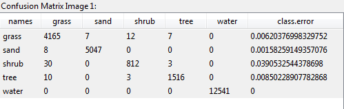
So in our case, e.g. 30 pixels have been classified as shrub even though they are inside grass training areas. This is not a true validation of the result as this should be done with polygons that are not used for training the model. Unfortunately, validation data was not available, but this method gives an (most likely overestimated) impression about the accuracy.
For more information, see the tutorial on statistics.